Providing accessible content to everyone at ETSU is an ethical imperative, a university
policy requirement, and a federal law.
The Office of University Marketing and Communications offers several assets to assist students, faculty, and staff in creating accessible digital content.
Recorded Trainings
Fixing Accessibility Problems in PDFs
This introductory training covers how to remediate accessibility issues and make existing PDF documents accessible.
We look at some of the most common accessibility issues in PDF documents and show you how to address them.
Creating Accessible Word Documents from Scratch
This training provides a broad introduction to accessibility, then focuses on practical steps to ensure your Word documents are accessible.
Creating Accessible PowerPoint Presentations
This training provides a broad introduction to accessibility and then focuses on practical steps to ensure your PowerPoint presentations are accessible.
As you work toward cleaning up the documents on your department’s website, refer to our Where to Store Digital Documents page on the best places to store documents moving forward.
Content Accessibility Checklist
The following tips can assist you in ensuring your content is accessible.
-
General
Communication Style
Reference: Hemingway Editor
- Is my content free from jargon, acronyms, and other language that may be unfamiliar to my intended audience?
- If I am using acronyms or abbreviations, do I spell out the full word or phrase on first reference?
- Is the reading and comprehension level appropriate for my intended audience?
- Is my writing or speech clear and concise?
Technical Considerations
- Does my content layout resize and adjust based on the view port? For example, is my content as intelligible and user-friendly when accessed on a mobile phone as on a desktop computer?
- Can users navigate my content using only a keyboard (no mouse)?
- Does my content load quickly, even for users with limited internet access?
- Have I provided a way for users to give feedback to improve the accessibility of my content?
-
Documents
Titles
- Does my page or document have a title defined in the metadata?
- Does my title make sense and describe the contents?
Structure and Hierarchy
- Am I using defined headings appropriately throughout my document?
- Am I using defined lists?
- In exporting my document, have I ensured that bookmarks are included?
Font
- Use a sufficiently readable font size (11 pt or more is recommended)
- Choose clean, readable fonts, and avoid intricate fonts that are hard to read
- Ensure that your text clearly contrasts the page or background color. (If you printed your document in black and white, would there be enough contrast?)
Links
- Have I tagged my links (and not just relied on auto-generation)?
- Have I provided appropriate screen tips and descriptions for links?
- Is my linked text 100 characters or less?
- Have I avoided using the long-form url as my linked text?
Tables
- Have I defined the header rows and/or first columns in my tables?
- Have I split complex or nested tables into individual tables?
- Are my tables being used to organize information, or am I using them for aesthetics only? Avoid the latter.
Media
Have I followed the accessibility best practices for any attached or embedded images, videos, or audio files?
URLs
When creating urls online, place dashes between words for easier reading. For example set your url as etsu.edu/an-example, not etsu.edu/anexample.
-
Images
Alt Text
Resource: aHrefs Alt Text Generator
- Have I included descriptive, proofread alt text for all images and figures?
- Does my alt text avoid acronyms?
- Have I replaced generic descriptors with proper nouns, as applicable? For example, a more specific description for “a person in a business suit speaks with employees seated around a conference table” may be “CEO Margot Alvarez speaks with Acme Corporation employees seated around a conference table.”
- Does my alt text provide a robust experience for non-sighted users?
- Does my alt text convey any “flat text” included in the image?
- Are my alt text descriptions gender-neutral?
- For infographics and charts, have I provided a text-based summary as alt text or in the caption?
Design
Resource: Coolors Color Contrast Checker
- If there are charts, graphs, or text in my image, do they meet contrast standards for readability?
- Have I considered how my content will appear for color-blind users?
- If there is text in my image, is it large enough to be read easily?
-
Video
Captions
Resource: Notta SRT/Caption File Generator (free for limited use)
- Have I generated and uploaded a proofread caption file?
- Have I kept graphics and text clear of the area where closed captioning will appear?
- For instances where closed captioning is not available, have I included burned-in captions?
Text and Graphics
- Is my text large enough to read from a distance?
- Do graphics and text meet contrast standards for accessibility?
- Are graphics or text on screen long enough to be fully perceived and understood?
Effects
- Does my video avoid flashing or strobe effects?
- Does my video avoid shaky shots or rapid pans?
Transcripts and Bookmarks
- Have I provided a complete, proofread transcript alongside my video file?
- Have I provided descriptive transcripts for scenes with limited audio? Example: “visual footage of ROTC members running in the woods.”
- Have I added bookmarks or chapter markers as appropriate?
-
Audio
Captions
- Have I generated and uploaded a proofread caption file?
Transcripts
- Have I provided a complete, proofread transcript alongside my audio file?
-
Social Media Posts
Emojis
- Have I limited emojis to two or less?
- Do my emojis appear at the beginning or end of my text (and not in the middle)?
- If a screen reader were to skip my emojis, would my post still make sense?
Hashtags
- Are the words in my hashtags delineated through capitalization? (Ex. #ThisWorks)
- Have I been thoughtful in my use of hashtags? (#LessIsMore)
Text
- Am I using capitalization intentionally? Remember: screen readers read capital letters individually instead of as a word.
- Have I avoided using non-native fonts?
- Have I avoided instructions based solely on location on the page? For example, “check out the link below” may not make sense for all viewports or readers.
Media
- Have I followed the accessibility best practices for any attached images, videos, or audio files?
Content Audit and Clean Up
All ETSU employees are responsible for making their digital content accessible.
To ensure all public-facing content meets accessibility standards, the Office of University Marketing and Communications is working closely with content creators and managers across campus to clean up and remove outdated content and content that may not be fully accessible.
Effective July 1, 2024, any website content that has not been updated in the last five years will be subject to automatic removal by the UMC web team.
More Tips and Tricks
-
Tagging text as a heading
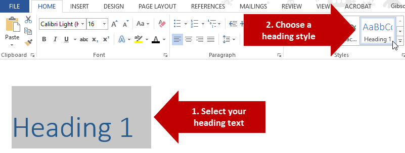
In order for a heading to be considered accessible it has to have more than just unique visual formatting. It has to be tagged as a heading. In Microsoft Word, tagging can be done using the Styles menu on the Home tab.

To use this menu, simply select the text that you want to tag as a heading, and then select the appropriate heading level in the styles preview menu (shown below).
-
How to apply headings level 3 or higher
By default the styles menu only includes pre-defined styles for Heading 1 and Heading 2. However, you can utilize more levels if needed. To do this, select the text that you would like to tag and then click on the More arrow button in the Styles menu, and then select Apply Styles.
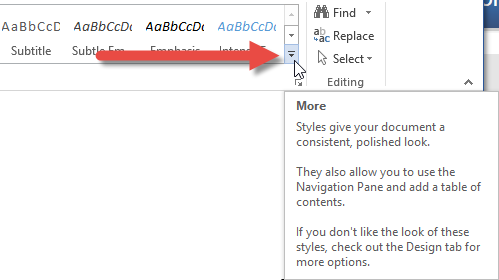
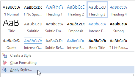
This will open up a small panel menu that will allow you to use a wide range of styles not shown in the styles tab menu. In order to use other heading levels, you can simply type the name of the style into the search box (e.g. Heading 3) and then click Apply.
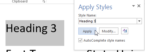
Once you have applied an additional heading level using the Apply Styles menu it will then appear as an option in the Styles menu in the Home tab.

-
Properly structured heading levels
Heading levels are used to indicate the hierarchy of content sections. The heading levels start at 1 and descend hierarchically with each successive number (2, 3, etc.). Therefore, Heading 1 is the top-most level, and would be appropriate for things like chapter or major section titles. Heading 2, and everything under it, would fall under Heading 1, and so on.
When using multiple heading levels in your document hierarchy, you need to be sure to descend through levels incrementally, without skipping levels along the way simply for the sake of aesthetics. If you skip through levels then you will create a document with unorganized heading tags that will not comply with accessibility standards. To illustrate this concept, it may be helpful to think of headings as being in a nested list. The list below illustrates an improper hierarchy that arbitrarily skips around between levels.
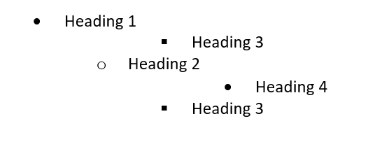
You can understand how a structure like the one above would be confusing. In order to avoid such confusion, you instead need to organize heading levels in a way that makes sense, as in the example below.
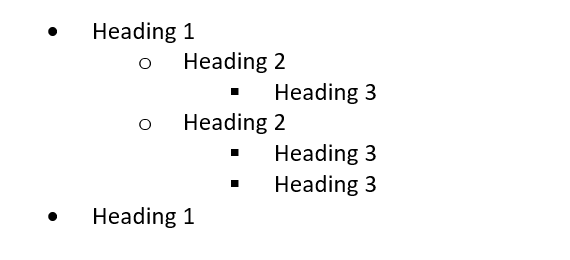
-
Meaningful links
Document authors will often include URLs in their documents to point readers to files or pages on the Internet. However, including full URLs can frustrate users who rely on screen readers, because they are forced to listen to the entire URL being spelled out character by character. For example, a URL like https://www.etsu.edu/ would be real aloud as Link: H-T-T-P colon forward slash forward slash W-W-W dot E-T-S-U dot E-D-U forward slash. This is not the most convenient way to be led to the ETSU home page.
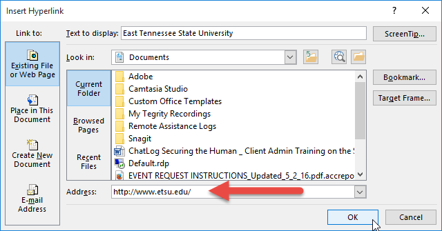
Rather than spelling out URLs, hyperlinks should instead be embedded within meaningful text which describes where the link goes. For example, if you want someone to visit the ETSU home page then you could simply hyperlink some text that says "visit the ETSU homepage." This provides the link while also describing where the link goes.
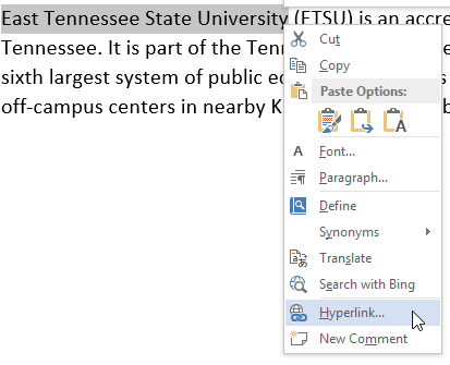
To create an embedded hyperlink, just select the text you want to add a link to, and then right click the selected text and choose Hyperlink from the context menu.
Resources
The ETSU Brand
Our brand guidelines ensure the university has a unified look and feel when telling the ETSU story.
We invite you to become a brand ambassador and help us comunicate how ETSU makes an
impact in our region and beyond.

 Voyager Maintenance Outage